I am a grumpy information worker. I work with customers for weeks, sometimes months, hammering out an information architecture for their Office 365 assets. We sweat details of navigation, metadata, and security. Queries are honed, web parts are implemented. User testing goes great. Naysayers start nodding their heads and smiling. Test groups give us notes and we knock off the rough edges. Plans are made, final deadlines are set and in a final attempt to button up the project someone goes and shows an executive and the fateful question is asked.
Could You Make an Executive Dashboard for This?
I hate dashboards. There are lots of reasons I hate dashboards. Some of my reasons are pretty valid (even if I say so myself) and many of the reasons I hate them are pretty petty. For the purposes of this article I will skip my issues and we will assume that dashboards are not a terrible concept, but I urge everyone to do a little research before implementing them for real. There is an art to presenting the correct information and the correct amount of information in a dashboard. Don’t go into the process casually. Part of the reason the last minute introduction of dashboards is so painful to me is that executives, like many of us, are 80-20 thinkers. By that I mean many projects can be 80% implemented quickly and efficiently. The final details of a project, that last 20%, can often take as much time and effort as the 80%. The difference between most people and many executives though, is that they think saying "Could you make an executive dashboard page for this?" was the 80% of the project. It took them 15 seconds. This isn’t about making a good dashboard, other than to say it is an art. People who excel at making them have a real skill and the ability to boil down a massive amount of data to a bar chart is not something to be taken for granted. This article is about one specific tool Microsoft has made available to us. A tool that, in the right hands, can convey meaningful, actionable data in an attractive and efficient way. That tool is JSON Column Formatting.
Make It Fast, Make It Pretty
Over the years Microsoft has created many tools to help people present data in a way that is easier to consume.
Excel , PowerPoint, Performance Point, PowerBI and several others are great tools. Many of them can work with any number of data sources, some of them focus on ways to make the information you are portraying as attractive or as impactful as possible. JSON column formatting is a little more direct. It works with SharePoint list and library columns. That’s it, List and Library columns. I like a direct tool personally, it can take out a lot of guess work.
What kinds of things can you do with this approach? To start we have all of our standard HTML formatting tricks, size, color, emphasis of various kinds. You can also add any of the icons from the Office UI Fabric. With a little extra work can do all kinds of conditional formatting. Items over a threshold can be a different color. Pie charts, pseudo bars charts, buttons, links. In short you can do lots of stuff. I will give you other places to look later in this article to give you a ton of examples, but first let’s go over something basic. To do that, we need Data. Create or choose a simple list for your tests.

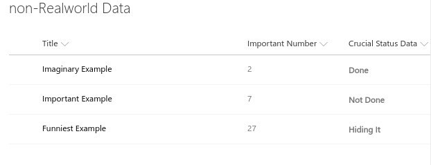
This list is fine, it has 3 key datapoints. A Title, an Important Number, and Crucial Status Data. I am not very happy with the lack of emphasis on our "Critical Status Data" though, it’s critical right? This is where JSON formatting comes in. Let’s punch up this column a little.
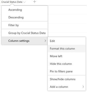
Click on the column you want to format. Hover over Column Settings in the dropdown. Click on Format this column.

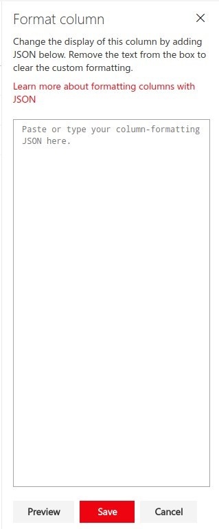
You will be presented with a column on the right side of the screen like this:

Do you see where it reads "Paste or type your column-formatting JSON here"? Let’s do that, relax I will explain stuff later. Paste in this bit of code and hit save:
{ "$schema":"http://columnformatting.sharepointpnp.com/columnFormattingSchema.json",
"elmType":"div",
"style":{
"font-weight":"bold"
}, "txtContent":"@currentField"
}
This should be the result:

Disappointed? Yeah, I was too when I created this example, but I promise you, the results in that column are now in bold text. It just wasn’t a dramatic enough change. I want emphasis, this needs more cowbell. On the bright side it is a very simple example of what can be done. With just a few lines we changed the presentation of an entire column.
I did mention earlier that we have the whole range of HTML tricks though, so let’s make a small change that I know will have impact. Pink!
Get back into the panel where we pasted our code and make this change and save it:
{
"$schema":"http://columnformatting.sharepointpnp.com/columnFormattingSchema.json",
"elmType":"div",
"style":{
"font-weight":"bold"
},
"txtContent":"@currentField"
}
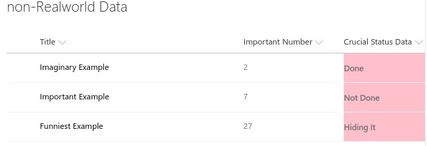
One comma and one extra line "background-color":"pink". Was it enough?

I think we have it! That crucial data looks crucial now, it’s bold, it’s in a different color, it stands out the way something important should.
Dude, Do You Even Know What a Dashboard Is?
I didn’t say we were going to build a dashboard in this article, I said I wanted to explore a tool that can be used to to build them. We need to walk before we run. Our first examples have been static methods for drawing attention to one column of data, but that is just a start of what we can do. For the rest of the article I will explain some of what we did, and in Part 2 we will talk about Conditional Formatting to get us closer to that Executive Dashboard experience.
Let’s unpack that first batch of formatting code we used:
{
"$schema":"http://columnformatting.sharepointpnp.com/columnFormattingSchema.json",
"elmType":"div",
"style":{
"font-weight":"bold"
},
"txtContent":"@currentField"
}
That first line "$schema":"http://columnformatting.sharepointpnp.com/columnFormattingSchema.json", is a standard part of these formatting projects. If you visit that link, and you should, you will see the schema for these samples, created for us by the fine people at Microsoft Patterns and Practices. What does that mean? It means that on the next line when you see "elmType":"div" you can search in the columnFormattingSchema.json document for the phrase "elmType" (it stands for "element type", if you are curious) and find this section:
"elmType": {
"description": "The type of element to create",
"enum": [
"div",
"button",
"span",
"a",
"img",
"svg",
"path"
]
}
You can add any of these 7 HTML Elements or SVG Elements ("div", "button", "span", "a", "img","svg", "path") to the formatting of your column.
In our examples we added an HTML <div> (division or section) with a background attribute
and a font-weight style property. That schema document tells you which elements you can create. The "txtContent": property, that we used to output our "@currentField" (the contents of the column field) information is in that schema. The rest of the columnFormattingSchema.json document goes on to define other properties, attributes, expressions, operands, etc. we can use as part of our custom formatting.
In the 2nd part of this blog I will talk more about Conditional Formatting instead of the static variety we have focused on so far. If you can’t wait, give the SharePoint/sp-dev-column-formatting github
a good look. It contains a bunch of great examples like this:

It’s starting to look more like an executive dashboard around here, isn’t it?
Check out our next blog on how to add functional flair. Adding Pictures to a SharePoint list.
